
Pie Forms has several Advanced fields in addition to the Standard ones.
If you are new to Pie Forms, you may want to look at How To Create Your First Form.
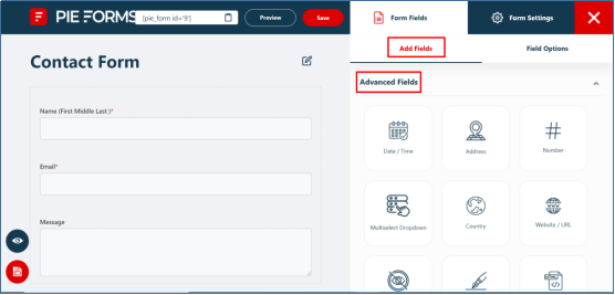
Go to your Pie Forms Admin Dashboard. Go to All Forms and click on the Edit button for the form you want to edit..

You will see the Advanced Fields Tab under the Add Fields options on the right side of the form editor.
Just like the Standard fields, each of the Advanced fields has some Basic and Advanced options. For details, please refer to our document of Standard Fields.
Advanced Fields in Pie Forms
Pie Forms has the following Advanced Fields for its users:
- Date and Time
- Address
- Number
- MultiSelect Dropdown
- Country
- Website/URL
- Hidden Field
- Signature
- HTML Code Block
- File Upload
- Section Title
- GDPR Agreement
- Rating
- Image Upload
Let’s discuss how you can customize the individual field settings using the super-easy drag and drop form builder.
Date and Time
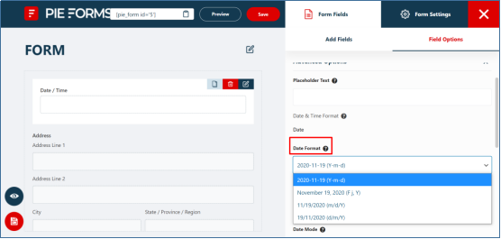
This field allows the user to enter/select the date and time in the form. You can change the Label, Meta key, Format, and Description from the Field Options > Basic Options.
In the Advanced Options, other than changing Placeholder Text, Hide Label, and Add CSS, which are common in all, you can customize the following settings:
- Choose the Date Formatfrom the four given options.

- You can also disable the dates which you don’t want the user to choose. Click on the disable fields in the form editor where a pop-up calendar will show up. From there,you can select multiple dates you want to disable.
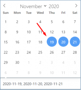

The disabled dates will be displayed like this on the front-end.

- Just below disable dates in the form editor you can select the Date Mode:single, range, or multiple depending on the type of form.
- You can also enable the checkboxes to set the date as default and select between the Minimum and Maximum range.


- This field also has the option to select the Time Interval between 15 and 30 minutes and the Format of time between 12 hours or 24 hours according to your need.
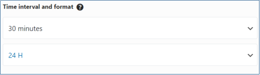

Note: Time will only be shown if you select Both from the format in basic options.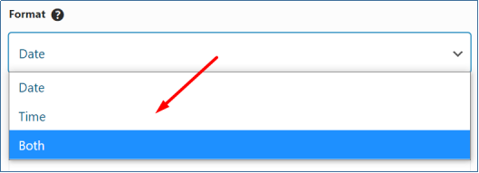

- Choose the Date Formatfrom the four given options.
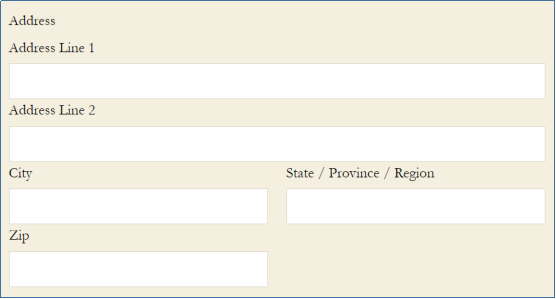
Address
This field has labeled sub-fields to allow the users to enter all address related information.

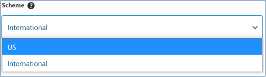
Besides the standard basic options, this field has a scheme option with two formats to choose from.
The first option is the US, which displays a drop-down list of the US states, while the second option is the International that shows a drop-down for several countries.
From the Advanced options, you can change the placeholder text of the sub-fields and hide the Address 2 field if your form has no requirement of it. You can also enable the checkbox ‘Show Detected City According to Site Region.’ to display the city label on the front-end as per the user’s location.


From the Advanced options, you can change the placeholder text of the sub-fields and hide the Address 2 field if your form has no requirement of it. You can also enable the checkbox ‘Show Detected City According to Site Region.’ to display the city label on the front-end as per the user’s location.
From the Advanced options, you can change the placeholder text of the sub-fields. You can also hide the Address 2 field if your form has no requirement of it.


Number:
This field of your form allows the user to enter any numerical value. From the form field options, you can edit the Basic options. The Advanced option has some additional settings for this field.


- Step: It allows the users to enter numbers at specific intervals. By default, it is 0,but you can change it according to the form requirement.
- Min Value: Specifythe minimum value for the user to start with.
- Max Value: Specifythe maximum value for the user to end with.
- Default Value: This will display the value you will select as default.
If the user enters any larger number than the set value, an error message will be displayed.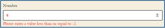

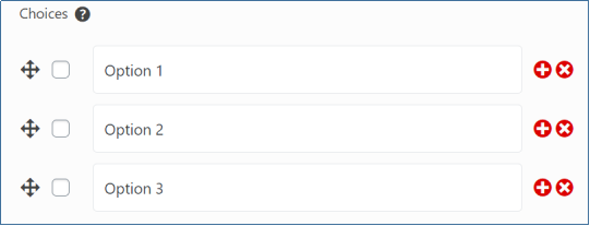
Multi-Select Dropdown:
With this field, you can add a list of options for your users to choose from. You can add or delete as many options as you want according to your form requirement from the Form Field options.

You can also hide the label and add a custom CSS class for this field from the Advanced options.
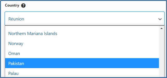
Country:
This field shows up a list of countries for the user to select. From the Basic options, you can select any country as default to be shown at the front-end.

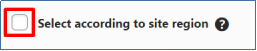
Other than all the standard Basic and Advance options, this field has one additional setting.
It has a checkbox to ‘Select according to site region.’ When enabled, the field will display the country label on the front-end as per the user’s location.

Website/URL:
This field allows the user to enter their website/URL. It can be of great help to connect with your users in the future and to know more about them. This field has all the Basic and Advanced options, like Label, Meta Key, Description, and more.
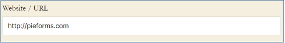

It automatically adds http:// to the text the user will enter to avoid any format confusion.

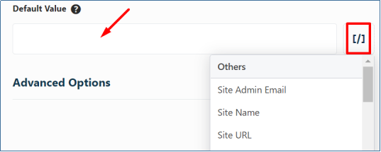
Hidden Field:
This field is not visible to the users on the front-end and is only used to collect additional information that the user can not change. The value is then stored on form submission in the database.
Besides the standard settings, you can set a Default Value for this field from the Basic options. You can also use Smart Tags, which has some predefined values, as shown below.

Signature:
This field lets you receive the E-Signatures of the user on form submission.
Users can do the E-signature using the Touch Screens or even with a mouse pointer.

With the cross sign shown above, the user can erase the signature if done wrong. E-Signatures are saved in the form of an image.
HTML/Code Block:
The content of this field is not displayed in the admin area. It allows you to add raw HTML code anywhere in your form, which helps insert text blocks, links, or images on the front-end.
This field has an additional Basic option to add the HTML Code.


File Upload
You can use this field to allow your users to upload all types of files on form submission.
Apart from the Basic and Advanced options that are common in all, you can also customize the following settings:
- Allowed File Extensions: Specify the type of file allowed to upload. You can add more than one file type separated with a comma like jpg, pdf, png.
- Max File Size: Restrict the file size in MBs.
- Maximum number limit on uploads: Mention the maximum number of files a user can upload.
Section Title
This field is useful when you want to break the form into groups or sections. It depicts a clear indication of a new area, which helps the user understand what the section is about.


The field has the Basic and Advanced options like all other fields.
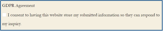
GDPR Agreement
This field is used to take user’s consent for collecting and storing their information on form submission. By default, this message will appear on the form if the field is selected.

You can add your custom message for this field from the Basic options. You can also enable the required checkbox to make it a required field in your form.That’s all! We hope this tutorial helped you in understanding the Advanced Fields of Pie Forms.
Rating
Use the rating field when collecting customer feedback, evaluating the success of an event, and knowing about user opinions through an easy-to-use set of icons.
Apart from the Basic and Advanced edits that are common in all, you can also customize the following settings:
From the Basic options select the rating scale.


From the Advanced options you can:
Icon: Select icons to display from the four given options of star, heart, thumb, or smiley face.
Icon Size: Choose the icon size from small, medium, or large.
Icon Colour: Change the icon color.
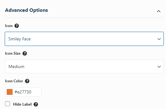

Image Upload
Let users upload images to your website. With the Face Detection feature, it will allow only human face images to be uploaded.
Apart from the similar edits in the Basic and Advanced options, you can enable Face detection to use this feature


